hi! i wrote a freaking thesis about the design styles of old evanescence icons... welcome.
✮⋆˙
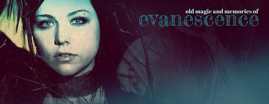
"The Forgotten Art of Icons For Web Forums" by rionka - 2025
𝖙his is a forgotten art of icons for web forums.
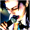
people used to make matching sets of avatar plus signature picture [sig] and sometimes it was truly a work of art. it's awesome to see the evolution in the design of these tiny little squares, from the simplest crops through the technicolor filters, light leaks, textures and effects to almost symbolic designs in pop art style. you can truly see the difference in styles and all the immense creativity, effort and devotion of many evanescence fans from the past. i love it so much.
i'm trying to define certain design styles of the early phase, peak and late phase. these icons are of course in chaotic order for now. this fashion was slowly dying after ev3 came out. i found some ev3 pieces (2011-12) but the majority is fallen/tod style (2003-2010).
this project is all put together of tiny pictures that i saved from fanpop, so unfortunately i'm not sure who made them. but if YOU know, please tell me. i will add the links to the authors.
𝖆fter the release of fallen & abh and slightly before the open door, the art of gifs and icons truly started to grow.
the early phase was characterized by simple graphics that were often just a photo crop, with quite basic colors and effects. gifs were often simple and kind of crude. this era has that distinct graphic flavor of 2000s. most favorite elements are frames, decorative squares, lines, gradients, high contrast and also blinkies (blinking gifs) or blinking elements placed into a static picture. evanescence font, anywhere font and lots of "goth" handwritten fonts were often used even though they're not always legible - but simple, small, pixelated fonts were also popular because these are easier to read.
𝖊vfans were better and better in editing so the icons started to look like miniature paintings.
extensive use of grunge filters, textures and colorful lens flares was common. this is probably my most favorite era. the majority of this happened between the end of the open door era and start of working on ev3 when there was a lot of time to think about it. the popularity of bright technicolor styles and lomography can be felt in the first half, and desaturation of the full colors and strikingly low contrast (tumblr fade) can be seen later, with more and more filters, color leaks and vignettes. the fonts aren't meant to be always readable, sometimes their role is just to act like another graphic element. the evanescence community already knows ALL the pictures (duh) so artists use unique photo crops, effects and words to distinguish their pieces, often making whole sets in certain moods for their blogs, forums and friends. the collages and diary pages, distinct "paper" and "sticker" graphics and other irl elements appear at the end, slowly leading to the next phase where the symbolism outweighs the lyrical content.

𝖘ymbolism, simplification and discoloration characterized the last wave of icons in the early 2010s, after ev3 tour.
after the full goth textured celebration with curls and shadows, the graphics became again gradually more clearer, emptier, simpler and lighter, with a lot of negative space - so called "modern" vibe. (i honestly like some parts of this aesthetic but i miss the creativity of the previous era). the unusual crop is still a good idea, and colors are more vivid again. icons look often like a page from a fashion magazine or a printed book. popular fonts are gradually more clean, all caps, sans-serif typeface, and various novelty fonts with "retro" feel. unfortunaly this was the end of popularity of blogs and forums - and like all the popular websites, our fan pages became white, boring and all the same. rip.